Even if it was a design fluke, there’s no way the logo got by an ENTIRE design team and not ONE of them noticed the resemblance.
A couple of logos aren’t something a whole design team would be involved with. The probable scenario is that it’s one employee, or contractor even, who maybe only reports to one or a few people. If those few don’t recognize something coy or silly added to a logo, on it goes to be accepted.
That’s how stuff like this slides so easily, even at a big company like google.
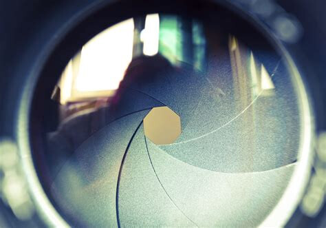
To be honest my first association with it was a stylized camera lens.
I can see how the younger generations who haven’t seen what camera lenses looked like before they were digitized and put into phones would not recognise it. Or fundamental Christians terrified of OK signs and logos getting wound up about it.
But the logo is old enough enough to be inspired by that and I find it more meaningful: google being a search engine allowing users to focus in on a subject…
It’s a bit more of a reach to figure out a motive for “666” the “number of the beast/man” being used. I would have thought 777 would be so much better for a company wanting to transcend everything with tech anyway. Why would they code the representation of human limitation into their own logo?
(We’re not going to get into allegations of weird cults here: this is moving into politics and definitely conspiracy theory stuff that is just going to get contentious and divisory, let’s keep it about the magick of the logo per the OP.)
If it is, as occultists shouldn’t we be able to scry into it and see what the energy and intent is behind the logo?
I see lots of muggle-style worrying about it but we can do a bit better, right? If we wanted to. Scry into it and tell us your UPG, now that’s interesting.
2 Likes
Even for their most popular web browser?
Yes, although this is veering into not really being magick related.
If you look at the logo design history of chrome, the original does not look like it has 666 in it at all. Maybe that original design had a few more people collaborating on the general concept, but the logo creation itself is a one person job and would have been subject to a lot less approval than you’d think. It’s a waste of time, money, and resources otherwise.
Whoever was tasked with making the changes to the logo in 2011, the one that does look like it has 666 in it, was probably just asked to make an updated, flatter, and less busy version of the original.
Similarly, the google play logo was designed in 2012, the one that some think looks like Lucifer’s sigil. Considering the time frame, I’d be willing to bet it was the same designer for both. The logo prior looked way different – it had that green robot that they were trying to market way more heavily at the time. The artist might have been given a prompt like “play button” and using the google colour palette.
My point is that I highly doubt there is some secret Luciferian cult at google. The designs are a little too clever for me to believe that it was some manager or other non-artist who came up with the ideas. The far more plausible scenario is some graphic designer who got some jokes in. There’s a smaller but not impossible chance they were a legitimate occultist themselves, but really there’s no way to know for sure.
1 Like
Hehehe we get so lost in “them” thinking (I am guilty of it too sometimes) that we forget it is we, the people, who decide what is entertaining enough for the mass media. It is also we who decide what sounds like a conspiracy and also what deserves massive attention (I’m looking at you, Flat Earth theory). So most of the time, it is just us distracting ourselves from what we are actually meant to do here.
That being said…
The use of occult principle and techniques is widespread in marketing, mainstream entertainment, probably the same for politics. I think some portion might not even use them consciously. Especially if you consider NLP and subliminal influencing a form of magick… but that might be a discussion for another time.
That google logo might be a coincidence, might be on purpose. As a metalhead, sensitive to seeing patterns like that in mainstream things. It has given me quite the giggle already.
1 Like
I would have to agree
Its not about there being “evidence”. Its a simple design. You either see it or you don’t.
1 Like
666 is also the number of WWW, the world wide web. So apropos for the world’s most popular web browser.
I completely agree with @Under_the_Skin companies from micro the juggernauts and particularly the latter are often steeped in the occult. Many of these logos are simply not logos, many of the C-Suite employees are major occultists many board members are also occultists. Many major shareholders same thing. To say that these similarities are just coincidences is absurd.
1 Like