1 Like
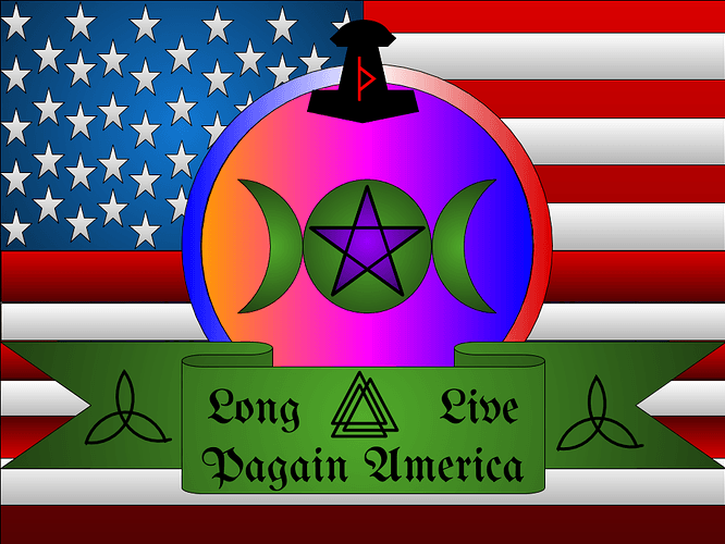
Ugh. The star spangled banner ruins everything.
A rule of aesthetics is to never have more than 3, or at a push 4, different colours and two different fonts present on a poster or banner.
Is that supposed to read pagan?
I have no idea what a "pagain* is, but that mess is hard on the eyes.
2 Likes
Actually, I don’t find it that ugly.
yeah typo
The flag does kinda kill the whole vibe… Frankly the American flag is so grossly overused that it comes off as tacky when used as a pattern on anything.
That’s way to busy. Try a more simpler design.
1 Like

